
SYNE
Product Design for a Groovy New Audio Companion

TEAM
3 UX Designers
DURATION
3 Weeks
TOOLS
Figma, Figjam, Miro
MY ROLE
UX Researcher: Competitive & Comparative Analysis, A/B Testing, Prototype Testing
UX/UI Designer: Mobile App Settings, Configuration Flow, Art Visuals Library, Syne Screen Interfaces
METHODS USED
Competitive & Comparative Analysis, Persona Creation, Customer Journey Mapping, Site Mapping Feature Prioritization, Wireframing & Prototyping, Design System Creation & Organization, Usability Testing, A/B Testing

OVERVIEW
Meet Syne: A sleek new device for music lovers’ home or office.
Founder Gordon Droitcour has been a stage designer for artists like Billie Eilish, Kacey Musgraves, and Lauv. His vision is to bring the concert experience home with Syne, a sleek screen that displays content to accompany audio that a user is playing on their favorite streaming service.
To bring this new product to a stage ready for developer handoff, I worked on the foundational designs for the Syne display screen as well as the mobile app that controls it.
PROBLEM STATEMENT
Music listeners need a way to display album art without digging through their vinyl collection- album art on a phone is just too small to enjoy. Users who want a more sophisticated, three-dimensional, and informative streaming experience can use a Syne screen to display unique visual content. The Syne screen aims to enhance audio with custom animations and provide detailed information about songs, albums, and artists.
PRODUCT GOALS
MOBILE APP
Create an intuitive home screen with controls for operating the Syne screen
Settings options allowing user to adjust Syne screen and access a library of art visuals
Configuration flow for users setting up their Syne device for the first time.
SYNE SCREEN
Design interfaces for a tablet-like home device showcasing the following display modes: album art & artist, lyrics, album notes, and animated art visuals
Perform A/B testing for multiple screen sizes/ratios to evaluate usability
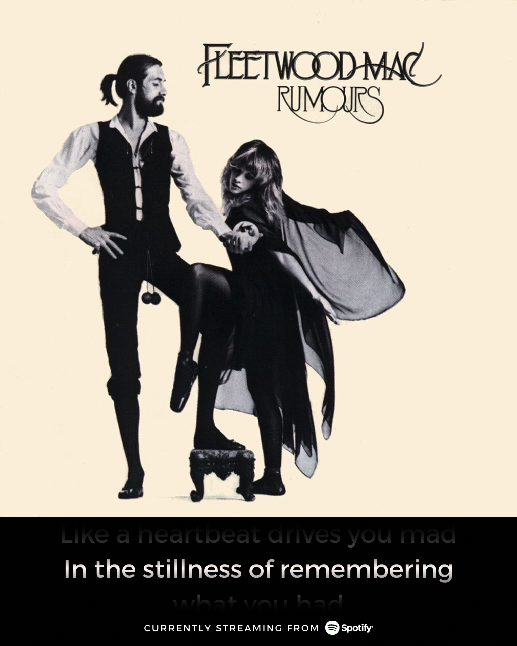
The Syne screen displays album art and other visuals When a user starts playing music on a streaming service, they can select the Display Mode for their screen from the Syne mobile app. The Syne screen will update in sync with the audio currently being streamed.
RESEARCH
With a clearly defined product concept in place after our initial meetings with with our client, I was able to develop a persona to refer to as our target user as we continued to develop the Syne screen and mobile app.
PERSONA
USER FLOW
DESIGN
MOBILE APP UI
I was responsible for designing mobile app settings and the library of animations for the Syne screen’s “Art Visuals” mode.
Users can select the animation that they would like displayed on their Syne screen to accompany the music they are currently streaming.
My goal was to create an appealing experience that would invite users to explore the library, allowing them to preview the animation they have selected on their Syne screen in real time.
MID-FIDELITY ITERATIONS
HIGH-FIDELITY RESULTS
CLICKABLE PROTOTYPE: ART VISUALS
FULL MOBILE APP PROTOTYPE
FACING PRODUCT LIMITATIONS: SYNE SCREEN DESIGN
One of the fundamental ideas behind Syne is to replicate the classic experience of propping up a record sleeve and admiring the album art while rocking out.
However, achieving this vision would prove to be complicated in the manufacturing stage. A 5:4 ratio screen captures the record cover aesthetic, but is an unusual tablet size and expensive to manufacture.
The more commonly available 16:9 screen ratio is much more economical and easy to produce.
Keeping these restraints in mind, my teammates and I created different iterations of screen displays using both ratios during rapid design studio sessions.
We hypothesized that a 5:4 screen design would ultimately create the best experience for our users because of its striking visual impact, distinguishing it from other devices a user might already own in their home.
16:9 SCREEN DESIGN ITERATIONS
The 16:9 screen ratio allowed room for more text, like lyrics and album notes. However, it does make Syne look like any regular tablet or monitor and does not replicate the recognizable vinyl record cover look that our users might find more appealing.


5:4 SCREEN DESIGN ITERATIONS
The unique 5:4 screen ratio would make Syne visually distinct from other devices, and allows the album art to be the star.


DESIGN SYSTEM
When we first met our client, there were some basic elements outlined in a rudimentary style guide that would eventually influence the look and feel of the Syne screen and mobile app. These elements included basic logos, text, and some colors.
I worked with my team to expand the color palette, create logo variations, and most importantly organize the components that we had created during our design process into a full-fledged design system.
As Syne continues to evolve, this design system can be utilized by other designers to ensure visual consistency as more features are introduced to the product. It is a resource that can be adapted and refined over time.
STYLE GUIDE
COMPONENT LIBRARY
With a palette comprised of browns, greens, and Syne’s signature orange, it isn’t hard to see that the choices behind this style guide are meant to evoke the 1970’s.
Our client’s vision is tied to vintage aesthetics and nostalgic music experiences. The Syne screen is like an album cover that you might prop up on your record player. Funky fonts and colors were an essential part of solidifying this product’s cool factor.
TESTING
INSIGHTS
A total of 10 Usability Tests were conducted with going through 3 task flows: configuring their Syne for the first time, personalizing their Syne by changing Art Visuals, and adding a second Syne product to their account.
Below are some examples of the design changes implemented based on patterns and data observed during usability testing.
These test sessions also included A/B Testing of our various Syne screen ratio options. The feedback from our user testers
REFLECTION
This challenging design sprint taught me how to design a physical product and an app that work in tandem. It was beyond gratifying to know that my efforts will result in an actual fully realized product on the market- especially one that has such a unique niche to fill for fans of both music and tech.
Almost all of the potential users that were involved in usability tests and anybody else who I discussed this product with asked, “When is this going to be for sale? Because I want one.”