
HACKATHON 2021
Collaborating with developers to create a desktop site that crushes the competition.

MY ROLE
UX/UI Designer
METHODS USED
Affinity Mapping, Competitive Analysis, User Flows, Usability Testing, Wireframing, Rapid Prototyping, Presentation Creation
DURATION
72 Hours
TEAM
2 UX Designers, 4 Developers
OVERVIEW
THE CHALLENGE
Our team consisted of 2 UX designers and 4 developers. Together we were tasked with creating an app or website in 3 days in response to the open-ended theme “Pet Services.”
We could make any kind of product or service we wanted, so long as it was functional by the deadline and followed UX best practices.
Those 3 days were action packed with constant communication and cross-functional collaboration. We had to work fast.
THE RESULT
After 3 long days, multiple daily meetings with our developers, and the final presentation up for judgment by 3 industry designers, out of 10 participating teams our desktop site won:
1st Place People’s Choice Vote
3rd Place Overall
Our concept really connected with all the participating designers and developers who had dedicated their blood, sweat, and tears to this intense Hackathon.
Being the People’s Choice winner, or “Miss Congeniality” as I like to think of it, was absolutely the category that mattered the most to me as a commendation from an accomplished group of peers.
I was honored to have knocked it out of the park amongst the stiff competition.

DEFINING THE IDEA
The most difficult part of a hackathon is the lack of time.
My team immediately began brainstorming how to approach the “Pet Services” prompt. All hackathon participants were expected to identify a problem to solve quickly, in an hour or less.

I had recently become familiar with Petfinder on my quest to adopt a senior cat!
I told my team that there are filters for age and even “Special Needs” on Petfinder, but I have not encountered a site that focuses solely on these kinds of high-needs pets.
This conversation solidified our idea: a desktop site that aggregates adoption listings for pets that have greater needs due to age, health problems, and mental or physical disabilities.
We quickly threw out some name ideas (maybe a little too quickly), and “Purrpuseful Paws” was born.
The developers were determined to run with this idea and get to work utilizing Petfinder’s API.
Our stretch goal for the 3 days was to get our website to actually work by showing results for “Senior” and “Special Needs” cats and dogs.
RESEARCH
UNDERSTANDING THE USER

“I can ‘see’ her hearing and smelling and it makes me use my own ears and nose better. If I see her listening it makes me try to figure out what she is hearing.”

“I love that he shows people resilience, love, and no matter what life throws at you, there’s a way to overcome.”

“I can say with all honesty, she makes my life better everyday.”
These quotes are from real testimonials from high-needs pet owners that I sourced on various animal-related articles and websites. They served as inspiration for our persona. With such a condensed timeline for the UX process, this was a helpful method for understanding potential users’ needs, pain points, and motivations in lieu of user interviews.
CREATING A PERSONA
With limited time to get high-fidelity mockups in front of our developers so they could get to coding, I knew my UX partner and I would need to quickly jump into the design phase.
But first, I took on the responsibility of developing a persona to understand our product’s users as thoroughly as possible. What qualities define someone who would be willing to care for a pet that might have greater needs than usual?
DESIGN
With our developers grinding away at coding the foundations for our site using JavaScript and exploring how to access Petfinder’s API, my fellow UX designer and I jumped straight into mid-fidelity Figma designs.
I was responsible for the search results and animal profile pages. I also whipped up a quick logo.
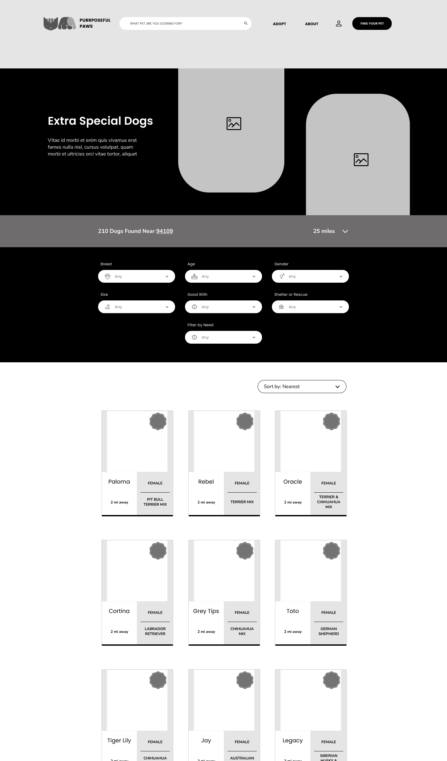
WIREFRAMING: MID-FIDELITY

STYLE GUIDE
RAPID PROTOTYPING: HIGH FIDELITY
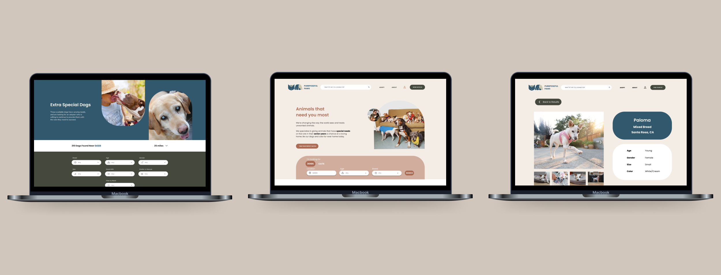
Landing Page
Search Results
Animal Profiles
USABILITY TESTING
Because of the pressure to hand off our designs to developers so they could start building, we only conducted usability tests after our high fidelity prototype was complete.
After three usability tests, we implemented minor changes in the UI to correct some areas of confusion. You can see two examples of these changes below.
MOMENT OF INSIGHT
It was fascinating to see how the developers reacted when it came time for us designers to share our work. The developers' mindsets were wired to quickly tell us if a component of our design was possible to create or not within the next 24 hours.
It was eye-opening to learn and better understand the general time-frame of building certain parts of a design.
With mere hours before our final hackathon faceoff with the other teams, our developers came to an unfortunate conclusion: we could not successfully access the Petfinder API for our desktop site. After hours of troubleshooting, the API request continued to fail and we had to pivot.
Although our developers were unable to make a functioning website, we still managed to finish with a complete coded landing page and a hi-fidelity prototype demonstrating all of our screens and a full user flow.
RESULTS
CLICKABLE PROTOTYPE
After quite literally the fastest three days of my life, we finished strong by presenting our Figma prototype. Although it is not perfect, I was proud to have worked so hard on something that followed best UX/UI principles, had an appealing cohesive look, and had a positive philosophy as a product.
DEVELOPERS’ FINAL PRODUCT
Our developers were successful building out a coded landing page based on the designs provided by the UX designers. Although they could not meet their stretch goal of accessing Petfinder’s API for a real search, they built out code including search criteria for high needs pets
Tools Used: JavaScript, Ant-design, Axios, React, MongoDB
CONTROLLER ENDPOINT SETUP

CALLING THE PETFINDER API

Below is the final landing page produced by our developers in just a few short hours. Compared to our high-fidelity designs for the landing page shown above, they did a pretty amazing job!

NEXT STEPS
Code remaining pages
Continue building wireframes for the complete site
Build out “sort” and “filter” capabilities and search
Deploy the backend
Additional prototyping and usability testing
REFLECTION
It was an absolutely incredible experience having the opportunity to work directly with developers. To my surprise, I found myself asking a lot of questions about the how out of pure curiosity. Luckily, this curiosity ended in increased shared understandings and empathy towards one another, which allowed us to discover how we approach the same problem differently.
I was intrigued throughout the entire sprint to understand why certain elements couldn’t be completed due to the time so I could have a better grasp on this moving forward with design decisions in the future. I had been told throughout the course the majority of designs aren’t able to be completed purely because of time and resources; this project validated this insight after experiencing it firsthand.
All in all, it was an enjoyable, refreshing, and extremely educational design sprint, where constraints were at quite an all-time high, but we were able to collaborate effectively to ensure we designed, developed, and delivered a fun product.